Loading page…
All work
Ecommerce · Storefront + Dashboard
Fern
A botanical wellness storefront, plus the analytics console behind it.
- Client
- Fern Ecosystems — botanical wellness brand
- Industry
- Ecommerce · Beauty & natural wellness
- Market
- English-language, Scandinavian brand positioning ("Designed in Norway")
- Our role
- Design & full-stack development — storefront and internal dashboard
- Timeline
- Ongoing
- Year
- 2024 — 2025
fern-nature.vercel.app
React 19ViteTypeScriptTailwind CSSMotionAnalytics
2
Surfaces: storefront + operator console
5
Dashboard analytics domains
1
Shared design language across both
The brief
What the project had to solve.
Fern sells sustainably sourced botanical remedies: pure wild honey, cold-pressed botanical oils, and organic skincare. The project is deliberately presented as one case study rather than two, because it is one product: the customer-facing storefront and the operator-facing dashboard were designed together, share a visual language, and demonstrate the thing that actually matters commercially — the same person can build the shop that takes the order and the console the team uses to fulfil it.
The problem
Premium natural-wellness brands live or die on perceived purity, and the category is saturated with storefronts that look identical. Fern needed a storefront that reads as expensive and calm without slowing down — heavy imagery and motion are exactly what wrecks conversion on mobile. On the other side, the team was running the business out of spreadsheets, with no single view of revenue, order flow, customer growth, or which acquisition channel was actually paying for itself.
The approach
How it was built.
5 decisions that shaped the result — and why each one went the way it did.
Storytelling before catalogue
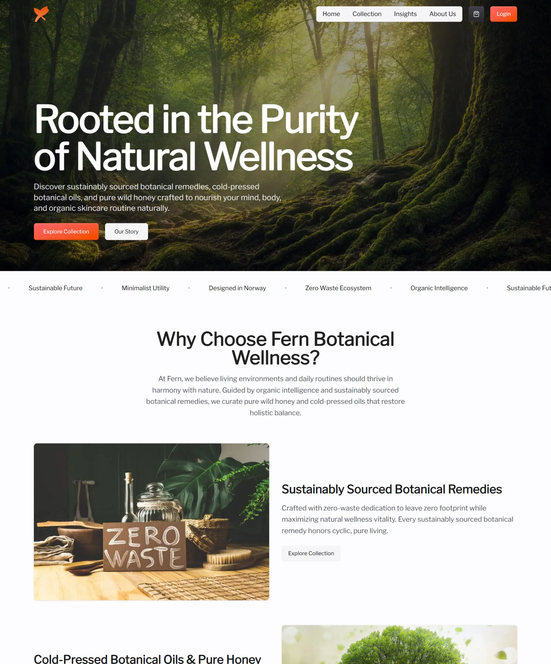
The storefront opens on brand promise — "Rooted in the Purity of Natural Wellness" — and a marquee of brand values (organic intelligence, zero-waste ecosystem, minimalist utility, designed in Norway) before it shows a single price. Three value pillars then carry the visitor into the collection with a specific reason to care about each product family.
Restrained motion, budgeted
Motion is used to reveal and settle content, never to block it. Transitions are short, transform- and opacity-only so they stay off the main thread, and the hero is treated as an LCP element rather than an animation stage — the page feels crafted without costing first paint.
Checkout-first layout
Every surface keeps the path to the collection and the cart one tap away on every breakpoint, so browsing friction stays low regardless of where a visitor enters.
A dashboard built around the questions actually asked
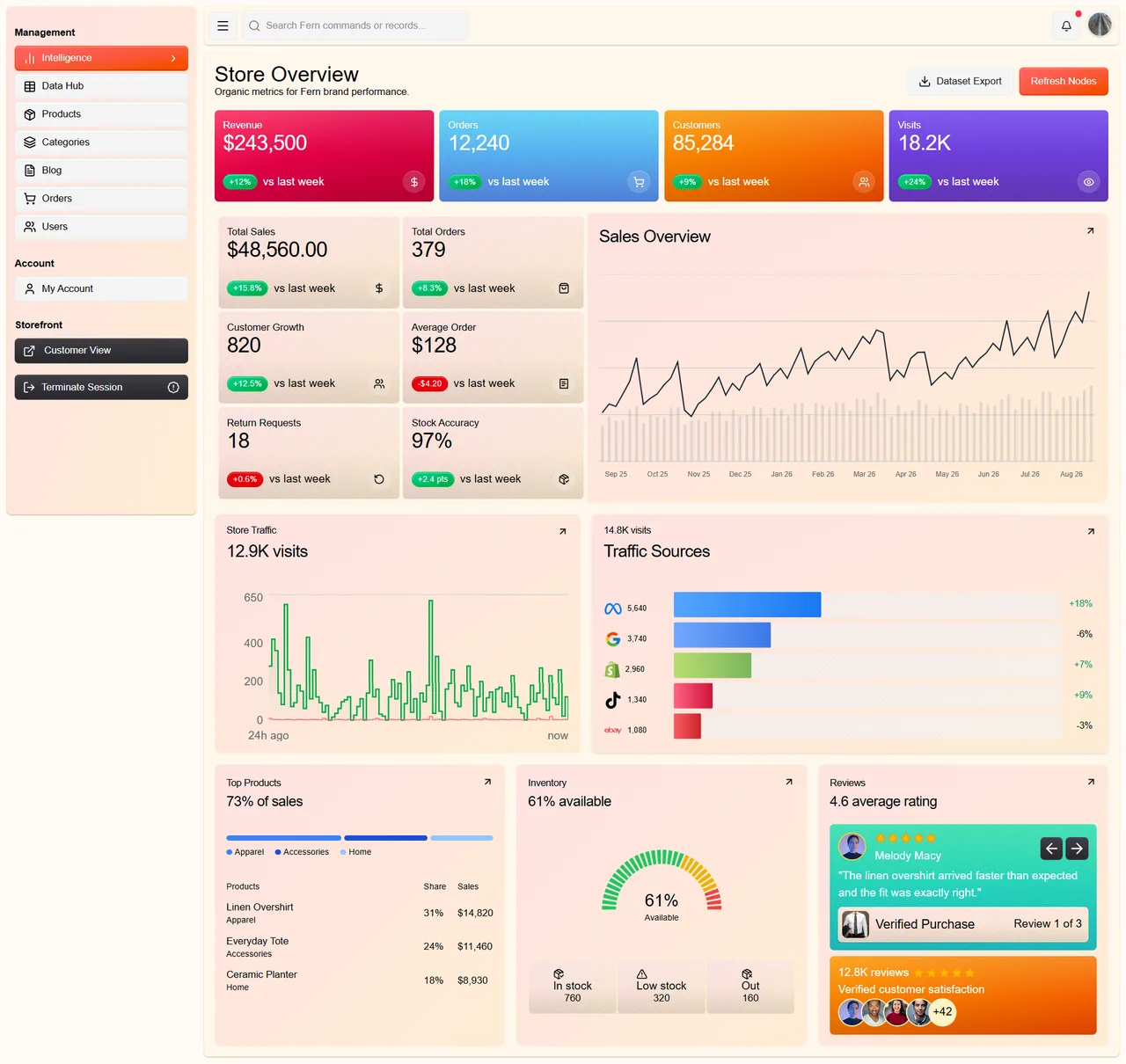
The console is organised by the five things the team checks daily: how much revenue came in, what is happening with orders, is the customer base growing, which traffic sources are converting, and what stock is running low. Each answer is one screen, not a report to assemble.
Retention loop
An email capture positioned as access to limited product drops and wellness insights — framed as "zero noise, purely organic updates" — so the list is built on anticipation rather than a discount code.
The whole thing
Every screen, top to bottom.
These are complete page captures, not crops. Point at one to walk it from top to bottom — on a phone it plays as it comes into view.
fern-nature.vercel.app
 Full page
Screens
A closer look at what shipped.
fern-nature.vercel.app
What it does
Shipped features
- Immersive brand hero with animated value marquee
- Product collection with story-led merchandising
- Insights / editorial section
- About and brand-story pages
- Customer account login
- Newsletter capture for limited product drops
- Fully responsive, mobile-first layout
- SEO-tuned titles and descriptions targeting botanical and organic-skincare intent
- Dashboard: real-time revenue analytics
- Dashboard: order tracking and status flow
- Dashboard: customer growth reporting
- Dashboard: traffic-source breakdown
- Dashboard: inventory and stock levels
What it runs on
The stack
Storefront
- React 19
- Vite
- TypeScript
- Tailwind CSS
- Motion
Dashboard
- Next.js
- TypeScript
- Tailwind CSS
- Chart rendering
Infrastructure
- Vercel
- Edge caching
The result
What the build changed.
One design system spans the shop and the console, so brand and tooling never drift apart.
The team moved from spreadsheet reporting to a single revenue, order, customer, traffic, and inventory view.
Motion and imagery deliver a premium feel without giving up mobile performance.
See it live
Let’s Work Together
Ready to build something fast?
Thirty minutes on what you need and what it would take. You leave with a clear recommendation either way.
Usually replies within a day · No obligation · Fixed-price quotes